

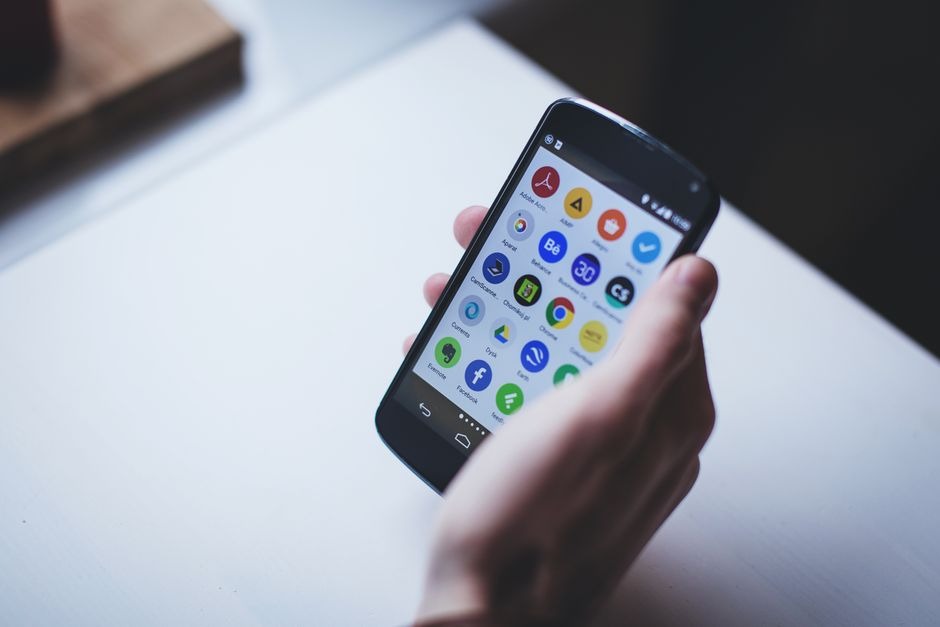
Open any modern betting app and you’ll notice something straight away: it’s not built for careful reflection. It’s built for motion. Scroll, tap, confirm, next. The interface is basically a one-handed decision machine.
Spend five minutes inside something like the tamasha game app and you’ll see the pattern. Markets are stacked like headlines, the bet slip follows you around like a shadow, and anything that slows you down gets “optimized” out. That is not an accident. That is design with a very specific goal.
So how do these interfaces push fast decisions, and what should you watch for as a user who wants convenience without getting played by convenience?
The main trick: reduce thinking time, not just tap time
Good UX in betting is less about pretty icons and more about shortening the gap between impulse and action. That sounds a bit cynical, but it’s also just true.
Apps do it by:
- Putting the most popular markets at the top (match winner, totals, handicaps)
- Hiding the long-tail stuff behind extra taps
- Surfacing “hot” events that already have momentum and attention
- Making the path from odds to bet slip feel automatic
You’re not meant to ask, “What should I bet?” You’re meant to ask, “Which of these ready-made options do I want?”
Visual hierarchy: why some odds feel louder than others
Betting apps are noisy by nature. Tons of leagues, numbers, timers, and promos, all fighting for space. The only way it works on a phone is ruthless hierarchy.
Notice what gets visual priority:
- Bigger fonts for primary odds
- Contrasting colors for live markets
- Badges like “Boost,” “Trending,” or “Cash Out”
- Tabs that keep you in the fastest lanes: Live, Popular, Quick Bets
Your eyes go where the design tells them to go. If the app wants you in-play, it will make the in-play section feel like the front door and pre-match feel like the side entrance.
The bet slip: the quiet MVP of conversion
The bet slip is where speed is either gained or lost. Apps treat it like a checkout page, because that’s what it is.
Common “fast decision” features include:
- Sticky bet slip that stays available while you browse
- Auto-updating odds warnings that you can accept with one tap
- Suggested stake buttons (10, 50, 100) so you don’t type
- One-tap rebet options for the same market type
A well-built slip reduces doubt. It makes the process feel clean and reversible, even when it isn’t. Once a bet is placed, you are in it, unless Cash Out is available later and priced in the book’s favor.
One-thumb navigation is a science, not a vibe
Most users hold their phone in one hand. That means the “thumb zone” matters.
Apps put high-frequency actions where your thumb naturally rests:
- Bottom navigation bar for key sections
- Big tap targets for odds boxes
- Swipeable market carousels
- Floating buttons for deposit, bet slip, or live stream
This is why some apps feel effortless and others feel clunky. It’s not only aesthetics. It’s ergonomics. If a user has to stretch their thumb for every second action, they bet less. That’s the business case.
Live betting UI: built for urgency
In-play betting is where interface design gets a bit intense. Prices move, markets suspend, timers tick down. The app has to keep you engaged while also protecting itself from stale odds and latency issues.
You’ll see:
- Flashing or color-shifting odds when they change
- Quick refresh behavior that keeps the screen “alive”
- Suspended market states that appear and disappear rapidly
- Micro-markets like “next goal” or “next point” that feel snackable
That snackability is key. A full match result is a long wait. A “goal in the next 10 minutes” market gives you a faster emotional payoff, win or lose. Interfaces are built to make those micro decisions feel normal.
Personalization: the app remembers what you like, and uses it
If you bet tennis props, you’ll start seeing more tennis props. If you click live football, live football will dominate your home screen. This is product personalization, and it’s effective.
From a user perspective, it’s convenient. From a platform perspective, it’s retention.
The danger is subtle: the app can narrow your world. You stop exploring and start repeating patterns because that’s what’s served to you. Repetition feels like confidence. Sometimes it’s just habit.
Notifications: the off-screen interface
Push notifications are part of the UI now. They pull you back in without you even opening the app.
Typical triggers:
- “Your bet is settling soon”
- “Big match starting now”
- “Price boost available”
- “Cash Out offer updated”
These are not neutral updates. They are timed nudges. If you want to keep control, turn off anything that feels like bait and keep only what’s genuinely useful, like security alerts or withdrawal confirmations.
Friction removal: deposits, biometrics, saved methods
Fast decisions require fast funding. That’s why betting apps work hard to make deposits feel like a normal mobile payment.
- Saved cards or wallet methods
- Biometric confirmation
- One-tap top-ups
- Prominent deposit buttons in the same area as the bet slip
Again, convenient. Also powerful. If you’re the kind of person who can get carried away during in-play chaos, this is where limits and reality checks become more than “nice features.” They’re guardrails.
What you can do as a user who wants the speed but not the spiral
You don’t have to reject the interface. Just use it with intent.
A few practical habits:
- Decide your stake sizes before the match starts, not after a goal swings your mood.
- Limit the number of in-play bets per game, even if the app makes it feel endless.
- Turn on 2FA and keep your account secure. Fast interfaces attract fast fraud too.
- Use deposit limits. Set them once and let them do their job.
- If you’re watching a live stream inside the app, remember there can be delay. Avoid betting on ultra-fast moments if your feed is behind.
The bottom line
Mobile betting interfaces are built to help you act quickly because quick action equals engagement, and engagement drives revenue. The design choices are not random. They’re tested, measured, and refined around how your thumb behaves when the game gets tense.
If you understand that, you can still enjoy the smooth experience without letting the app set your pace for you. The interface wants speed. You get to decide whether speed is a feature or a problem.
